Analyzing Bond Performance in Stock Corrections

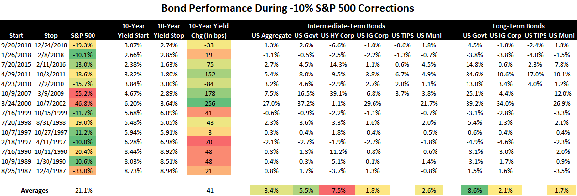
The table below shows the performance of bond categories during each -10% S&P 500 drawdown since 1987.
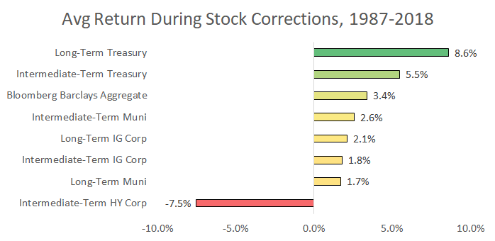
The charts below show the average performance figures. Since 1987, long-term U.S. government bonds have been the best performing category. But as the original table showed, yields cratered during most stock corrections over the past two decades.
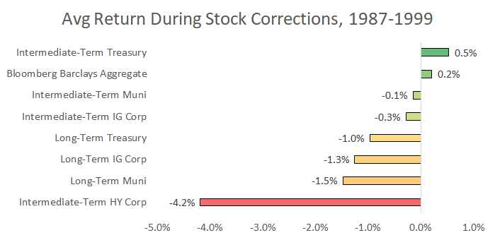
The averages from 1987 to 1999 paint a different picture. Long-term bonds performed much worse. In fact, no bond category provided a meaningful portfolio offset against falling stocks.
It’s a good time for investors to revisit the bond funds they use after 2019’s rally. The next sections dive into how interest rate risk, correlations, and credit risk impact portfolio returns. It concludes with the main funds I use and a summary of what’s most important for bond investors.
Interest Rate Risk
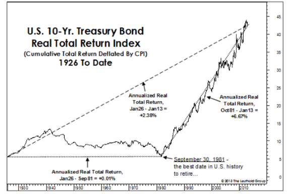
Forty years of a single market environment tends to create bad investing habits. U.S. interest rates have steadily fallen since 1981. Investors have consistently benefited from using long-term bonds and taking interest rate risk.
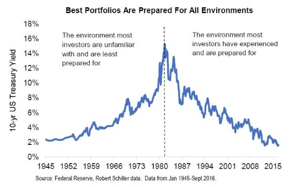
Bond performance since 1981 is anything but normal. Bonds provided zero inflation-adjusted returns from 1926 to 1981. The performance streak since 1981 has created two unrealistic expectations. One, that bonds earn high rates of return. Two, that if some duration risk is good then more is better.
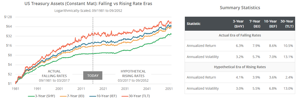
The graphs below create a simulated future where U.S. interest rates go higher and retrace their move since 1981. You can see two main takeaways for this hypothetical scenario in the bottom rows of the table.
First, if rates did a round-trip then returns for all types of bonds would be low. Second, short-term bonds with little duration risk would outperform long-term bonds.
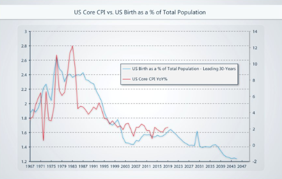
The other extreme potential scenario would be if U.S. interest rates continued to drop, like they did in Japan. The 10-year Japanese government bond yield hasn’t been higher than 2.0% since 1999. There is some evidence for this possibility. U.S. interest rates are tied to inflation, inflation is tied to demographics, and U.S. demographics are not inflationary.
The graph below shows the relationship between U.S. births as a percentage of the total population (the blue line) and future U.S. annual inflation (the red line). The blue line is advanced thirty years into the future. That said, demographics are just one driver of long-term interest rates.
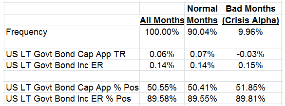
The table below shows 10-year U.S. Treasury bond performance during months where the S&P 500 declined more than 5%. The researchers wanted to find out where bond returns in these negative months came from – bond coupons or bond prices rising?
The column to the right, “Bad Months”, breaks down bond returns into capital appreciation (Cap App TR row) and income (Inc ER row). Bond returns during bad S&P months stem from the income, not price, component.
U.S. Treasury bonds of all maturities currently yield less than 3%. This means there will be less of a bond income buffer during the next stock correction.
Correlation
Negative correlation between stocks and bonds has supercharged the diversification benefit of bonds.
The long-term average correlation between stocks and bonds has been positive 0.20. A low positive correlation means stocks and bonds have diversified each other, but not in a huge way. This dynamic changed two decades ago when bonds started exhibiting a negative correlation to stocks. PIMCO wrote about one potential reason for this shift.

Combining two negatively correlated assets significantly reduces a portfolio’s volatility. One asset zigs when the other zags, dampening portfolio risk.
The three bars on the left show the historical volatility of different portfolios using the long-term stock/bond correlation of +0.20. The bars to the right show the same portfolios, but using the -0.55 stock/bond correlation since 2000.
For example, the grey bar in the middle is for a portfolio 60% in stocks and 40% in bonds. This portfolio’s historic annual volatility has been 10%, but it’s only been 8% when stocks and bonds were more negatively correlated.

Correlations increasing is not the end of the world. Correlation doesn’t tell you anything about the relative performance between stocks and bonds. Returns, not correlations, are what investors actually earn.
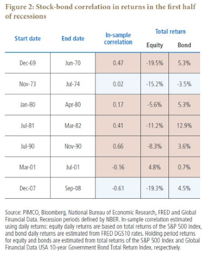
The table below shows that bonds have historically provided positive returns even during periods of positive correlations to stocks. That said, the bond returns below were all in periods when bonds offered higher yields and thus more of an income buffer.
Credit Risk
Trillions of dollars in index funds track the Bloomberg Barclays U.S. Aggregate Bond Index. Just one fund, Vanguard’s Total Bond Market Index, manages $215 billion. The aggregate index itself is a blend of investment-grade U.S. government, corporate, and mortgage-backed securities.
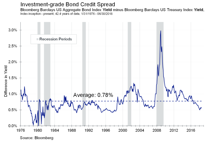
The average yield spread of this index (over risk-free Treasuries of a comparable maturity) has historically been 0.78%. On the surface you’d expect that this increase in yield was captured by bond investors for taking credit risk.
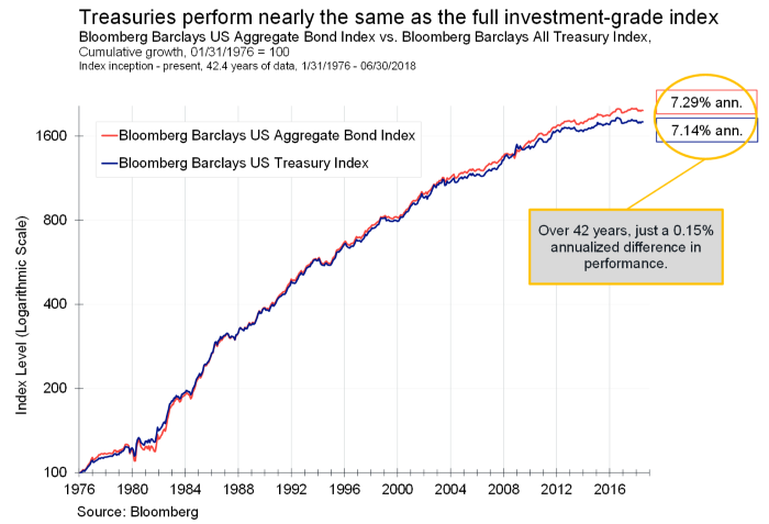
The reality is that the aggregate index has only outperformed regular U.S. Treasuries by 0.15%.
Corporate bonds represent 25% of the aggregate index. Both corporate bonds and stocks are tied to corporate profits and the business cycle. Since they’re related, corporate bonds tend to hurt your portfolio when you need bond help the most.
This corporate bond exposure is even more relevant today since the U.S. corporate bond market’s credit quality has weakened. The white line below shows the percentage of BBB bonds in the U.S. investment-grade corporate debt market. BBB is the lowest investment-grade credit rating before debt is downgraded to junk.
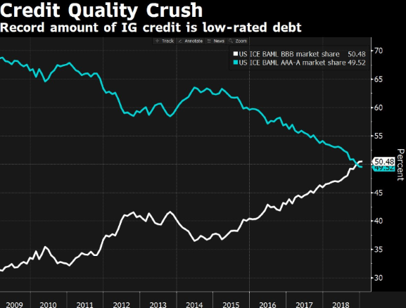
Corporate bonds, and the indices that include them, now contain more credit risk. Another potentially negative feature of the aggregate index is that it also contains more interest rate risk than ever before.
The Bond Funds I Use
The main bond funds I use are VGIT and VTEB. VGIT invests in Treasury bonds and I use it in tax-deferred accounts. VTEB invests in investment-grade municipal bonds and I use it in taxable accounts. Neither fund contains corporate bond exposure and both funds have expense ratios less than 0.08%. I also use VTIP for TIPS exposure.
Both VGIT and VTEB own intermediate-term bonds. This means they don’t implicitly bet on rates continuing to fall like long-term bond funds. Or that they bet on rates rising like short-term bond funds. I don’t know where interest rates are going and the track record of rate forecasters shows that nobody else does either.
Summary
- Bond Performance During Stock Corrections: Long-term Treasuries have historically been the best performers. In the 1987-1999 period when rates didn’t fall as much during corrections, bonds in general failed to provide portfolio protection.
- Interest Rate Risk: Taking additional duration risk rewarded investors for 40 years. Historically though, bonds haven’t earned substantial inflation-adjusted returns. Bond returns during really bad S&P months are primarily rooted in their income, not price, component.
- Correlation Between Stocks and Bonds: A reversion to a more normal (and positive) stock/bond correlation would translate to higher portfolio volatility.
- Credit Risk: The Bloomberg Barclays U.S. Aggregate Index has only outperformed comparable Treasuries by 0.15% since 1976. BBB bonds now make up more than 50% of the U.S. corporate bond market.
- The Funds I Use: VGIT, VTEB, and VTIP